GOV.UK is the UK government’s single domain website, serving as a central hub for government information, services, and guidance. Its core aim is to provide a user-friendly and accessible experience for both citizens and business users.
This project focused on enhancing the user journey for specific business users, with the goal of improving how they access and interact with the information and services most relevant to their needs.
My Role
In my role as an Interaction/UX Designer, I worked closely with a multidisciplinary team to identify and define issues within the service and information pages under the Business and Self-Employed categories. Our goal was to deliver a more user-friendly and accessible journey for business users.
The Problem
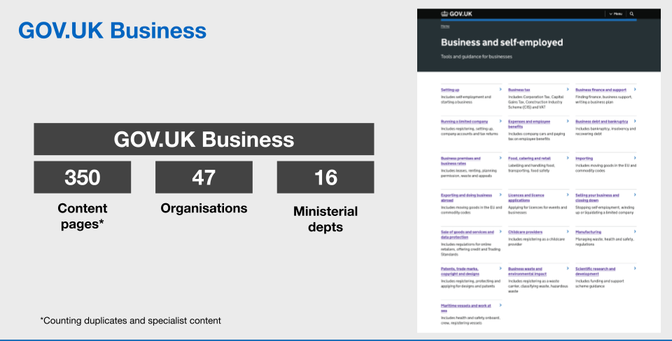
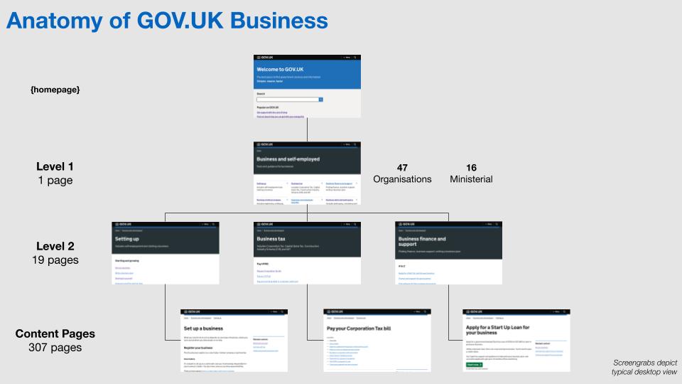
Due to the complexity of the GOV.UK website, certain topics often span multiple categories or are presented across several levels of pages. This overlap can lead to confusion, making it difficult for some business users to easily locate the information they need.
Understanding the problem
When I joined the project, a talented user researcher, information architect, and service designer had already completed one-to-one user interviews and developed user journey models. Building on their findings, I collaborated closely with the team to gain a deeper understanding of the challenges users were facing.
The research highlighted two key problem areas:
A specific tax topic that appeared across three different categories, causing confusion for users.
A need for a taxonomical rework to simplify the Level One (top-level) page and improve navigation.
Solution
Working closely with the team, we proposed two key solutions:
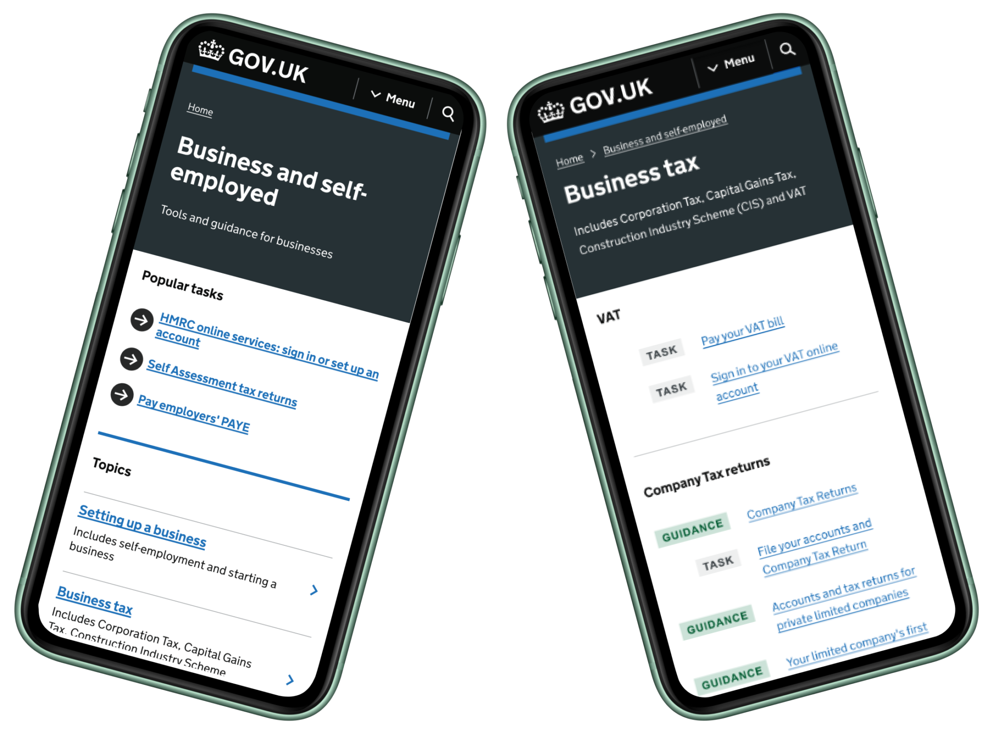
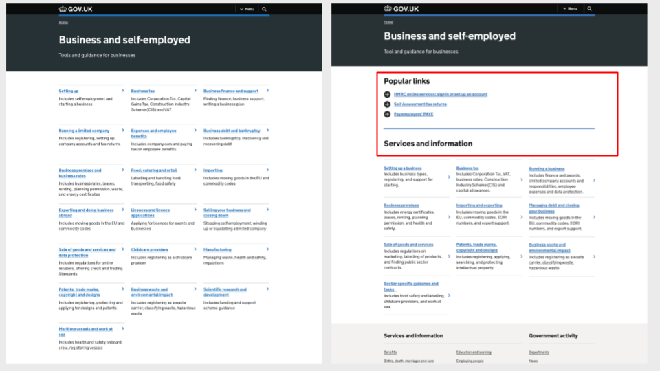
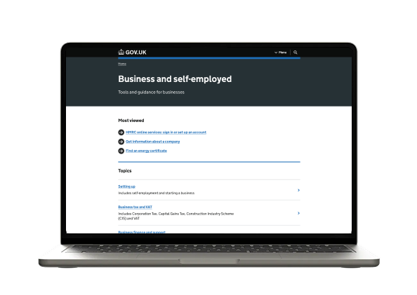
Introduce a “Most Viewed” section (originally titled “Top Tasks”) to the Level One page. This section served as a shortcut to the most popular and relevant topics, prioritised by the business to better meet user needs. We also introduced clearer headings to help define and group related topics, improving overall page scannability and navigation.
Revisit the site’s taxonomy at a later stage. Due to time constraints and the project nearing completion, we were unable to test or implement the recommended taxonomical changes during this phase. However, it was acknowledged as a necessary next step for improving long-term information structure and user experience.
Prototyping
A significant part of my role on this project involved designing and building prototypes using the GDS prototyping kit and Figma. These prototypes enabled users to freely interact with the proposed designs, allowing us to observe real user behaviour and gather valuable feedback.